
Innovation curves
S-curves and jobs to be done

Hey team,
This week we have been talking about obviousness and demand. I slipped those two topics in because They are both relevant to today’s discussion of s-curves. If you remember right back to our why be strategic discussion, I alluded to strategic tools appearing subjective and non-quantitative. These tools can look like graphs, but more often than not, they are more illustrative than investigative. That is how to think about s-curves. Don’t let their irksome lack of numerical data get in the way of a good mental model.

I don’t know how old you are. I am now in my mid-forties, which means I think I’m pretty young, but in reality, I’m not. The bright side is that I can pull together some great examples of innovation curves or s-curves out of my head to help illustrate this concept.
An s-curve is a graph of productivity through time for a particular innovation. Imagine things start slow; as the innovation gets worked out, things can get less productive for a while, then the innovation reaches a point of adoption dominant designs shake out, and efficiencies start to creep in. Productivity can increase fast in some cases and can even look linear for a while. Finally, the innovation’s productivity increases ease off, and the s-curve flattens out as a theoretical max is reached. Annoyingly, you will see I’m using performance, productivity and efficiency interchangeably. The more precise amongst us will find this irksome, sorry (not sorry.)
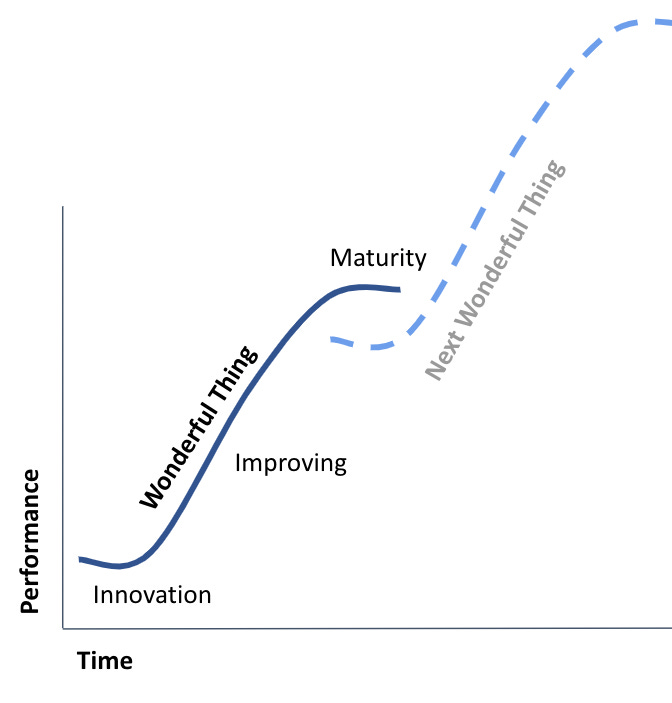
The s-curve is a pretty simple mental model. But, importantly, a single innovation shouldn’t be considered without other innovation journies around it. In the above example, we could be moving from cassettes to CDs. If we accounted for the complementary assets of the web and smart devices, this could also be going from CDs (or owned music) to streaming (or rented music.)
As geospatial strategists, we concern ourselves with innovation measured by the steepness of the curves (sustaining innovation) and the spaces between the s-curves (disruptive innovation). I’ve called this zone the “innovation space” in the diagram below, but you can call it what you want; there is some disagreement.

Overall this pattern of productivity increase across a number of curves could be looked at as industrial growth. I will address sustaining vs disruptive innovation in a future discussion. Sustaining innovation is “making the same thing better,” and disruptive innovation is “doing the thing in a new, better way.” Now, please do not assume that because something is not getting better, it stops being useful, that would be the wrong conclusion. At the flattening of the curve, the technology has reached a practical or theoretical peak. It will likely still be in general use for some time to come. But it may become a cash cow at this point: less investment in development and more of a sales focus. Keep looking around; you will see this pattern.
Let’s think about s-curves and GIS technology for a second.

Web maps are still better than augmented reality when I consider mapping interfaces today, but we all know that will eventually switch. Desktop GIS has become hybrid, effectively morphing desktop GIS into a web application.
When navigating between these s-curves, instead of looking at the technology itself, we need to consider the job to be done. Doing so will help determine when a leap between technologies might be necessary.
Do not misunderstand; I believe people will always be doing some sort of GIS activity. As we all know, data is universally bad, so data cleansing and management will always be necessary. GIS is not going away, but how we do GIS might easily change.
Jobs to be done
Interestingly, the subject of s-curves is essential but short. The concept is relatively easy to grasp, but it has far-reaching implications. The central one is abstracting ourselves from the technology we all love, instead focusing on the task we want to perform. Often referred to as the “job to be done,” this is critical when we engage in all those geospatial use-case discussions. The first thing to remind ourselves of is that if we are trying to find a use case for a technology, we might have got our innovation equation wrong; we are looking for a problem to meet our solution. This is a common anti-pattern in geospatial and is particularly present in the imagery and remote sensing community.
Consider all those examples we saw of car-counting from satellites in the mid-2010s. We were told Earth Observation would be pivotal to hedge funds and quantitative traders. We could count cars and thus measure the financial performance of big retail. What happened to those opportunities? Well, the hedge funds and traders bought credit card data instead. The job to be done was misaligned. The job was ‘understand financial performance.’ Counting cars was (still is) cool, but the task was incomplete without being able to infer the next stage. Pixels were not enough, the number of cars was not enough, and financial inferences still needed to be drawn. But, if the traders bought credit card data, that product was much closer to the desired “job.
If you are wondering about use cases, remember what jobs need to be done. If your technology solution is too many steps away from the required task, you are likely trying a little too hard. I once avoided use case discussions entirely, but I now realize that innovation can’t easily happen without those technology-to-application discussions, but do consider if you are trying too hard.
PS. In the development of new things, inertia is often the most significant barrier. Without a compelling benefit, it is hard to overcome that inertia cost.
Round Up
We’ve covered a lot in 2 weeks. I will be taking much of next week off, as I will be travelling. I will continue to share some of these posts on Linkedin and Twitter, and any help you are willing to provide would be very much appreciated. Look for more content in August!